- User Manual Conventions: used in the user manuals to highlight different types of information
- Tourplan NX Application Conventions: used in Tourplan NX to describe different parts of the screen
User Manual Conventions: used in the user manuals to highlight different types of information.
|
Convention |
Icon / Style |
Definition |
|---|---|---|
| Any field, button or screen area | Italics in this font | Depending on context, relates to any of the following: on-screen label, field to select, button to click or text to enter. |
| Menu selection, screen or form name | Bold in this font | Indicates expandable text, where clicking the bold text expands into more detailed text or an image. The effect is available only for online pages - printed pages show the expanded text/images under the bold text (except for obvious menu selections, which are not expanded). |
| Note (simple) |
|
Highlights a relevant comment or point about the section or procedure. |
| Note (more important) |
|
Specific information to be aware of about the preceding paragraph(s). Might include further important detail in italics. |
| Drop-down text |
|
(Online only) Right-arrow: expand more detail about the text immediately to the right. Down-arrow: collapse detail. |
| Previous / Next pages |
|
(Online only) Links that go to either the immediately previous or next pages in the navigation Table of Contents. These are different from the browser Back / Forward buttons, which go to the last page visited in either direction. |
| Expand / Collapse procedures |

|
Expand procedure providing more detail and example images. Collapse detail. |
| Procedure | Enter rate details | Heading label for procedures, which are specific tasks or sets of steps to be carried out. |
| Breadcrumb Trail | Menu > Sub-menu > Selection | Indicates a menu selection path to follow, to arrive at a particular screen. For example, Home > Bookings and Quotes > FITs. |
Tourplan NX Application Conventions
Tourplan NX Application Conventions: used in Tourplan NX to describe different parts of the screen.
|
Convention |
Icon / Style |
Definition |
|---|---|---|
| Hamburger Menu |
|
Menu icon used throughout Tourplan NX. Can represent different menus, depending on the application. |
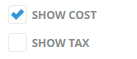
| Check-box |
|
Box that can be clicked (checked) to indicate true (i.e. include), or unchecked to indicate false (i.e. do not include). |
| Radio Button |
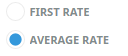
|
Choice made by clicking the label or button. |
| Drop-down List Field |
|
List of predefined codes/choices accessed by clicking the down arrow. Often found next to a Search button. |
| Tab |
|
Overlapping area of the screen, whereby only the highlighted tab's real estate is displayed. |
| Search |
|
An on-screen button with a magnifying glass icon indicates that a search for text entered into the adjacent field can be performed by clicking it. |
| Multi-Select List Box |
|
List of check-boxes of which all, some or none can be selected. |
| Required Field |
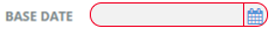
|
An area outlined in red on a form or screen indicates a field where data must be entered. |
| Side Panel Collapse |
|
The side panel on some screens can be collapsed to increase the main panel width. Select the blue right arrow to collapse and the blue left arrow to expand. |
| Edit |
|
An on-screen button with an edit icon indicates that users can drill down to edit/open/view/add information. |